ZitFuse Mobile App Redesign
Redesigning Zitfuse Ed-tech Application to make Learning faster, simpler, and more accessible for everyday University Students.
Duration
4 months
Role
Lead UX Designer
Tools
Figma, Principle, Maze, Miro
The Challenge
University students were struggling to keep up with their coursework due to missed lectures, poor access to quality resources, and a lack of syllabus-specific tutorials. Over 70% relied on scattered notes from WhatsApp groups, while YouTube content rarely aligned with what was taught in class. This led to low confidence, poor exam performance, and high academic stress—especially during finals week.
Key Problems Identified
- Limited access to consistent, quality learning materials.
- Inadequate revision tools and fragmented course resources.
- Missed lectures due to scheduling conflicts or illness.
- Over-reliance on in-person learning with little digital backup.
Design Process
Research
Understanding user pain points and market opportunities in mobile banking.
- Conducted 15 user interviews with Students at the CopperBelt University Students
- Analyzed competitor apps and identified key gaps
- Created user personas based on research findings
- Mapped current user journey and pain points
Ideation
Brainstorming solutions and defining the product strategy.
- Facilitated design thinking workshops with stakeholders
- Created 'How Might We' statements for key problems
- Sketched initial concepts and user flows
- Prioritized features based on user impact and business value
Design
Creating high-fidelity designs and interactive prototypes.
- Developed comprehensive design system and component library
- Created wireframes and high-fidelity mockups
- Built interactive prototypes for key user flows
- Ensured accessibility compliance and inclusive design
Testing
Validating designs through user testing and iteration.
- Conducted moderated usability testing with 12 participants
- A/B tested key interface elements and interactions
- Gathered feedback from internal stakeholders
- Iterated designs based on testing insights
Visual Design
The new design focuses on clarity, speed, and accessibility. We implemented a clean visual hierarchy with bold typography and strategic use of color to guide users through their financial tasks.
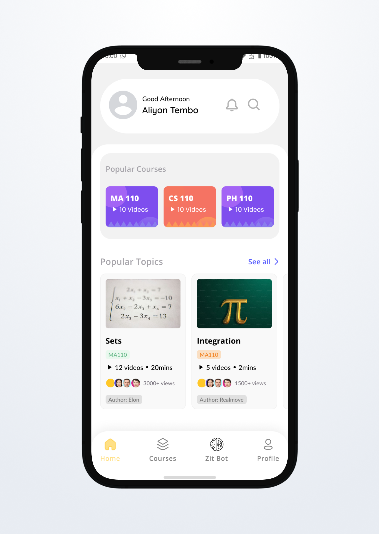
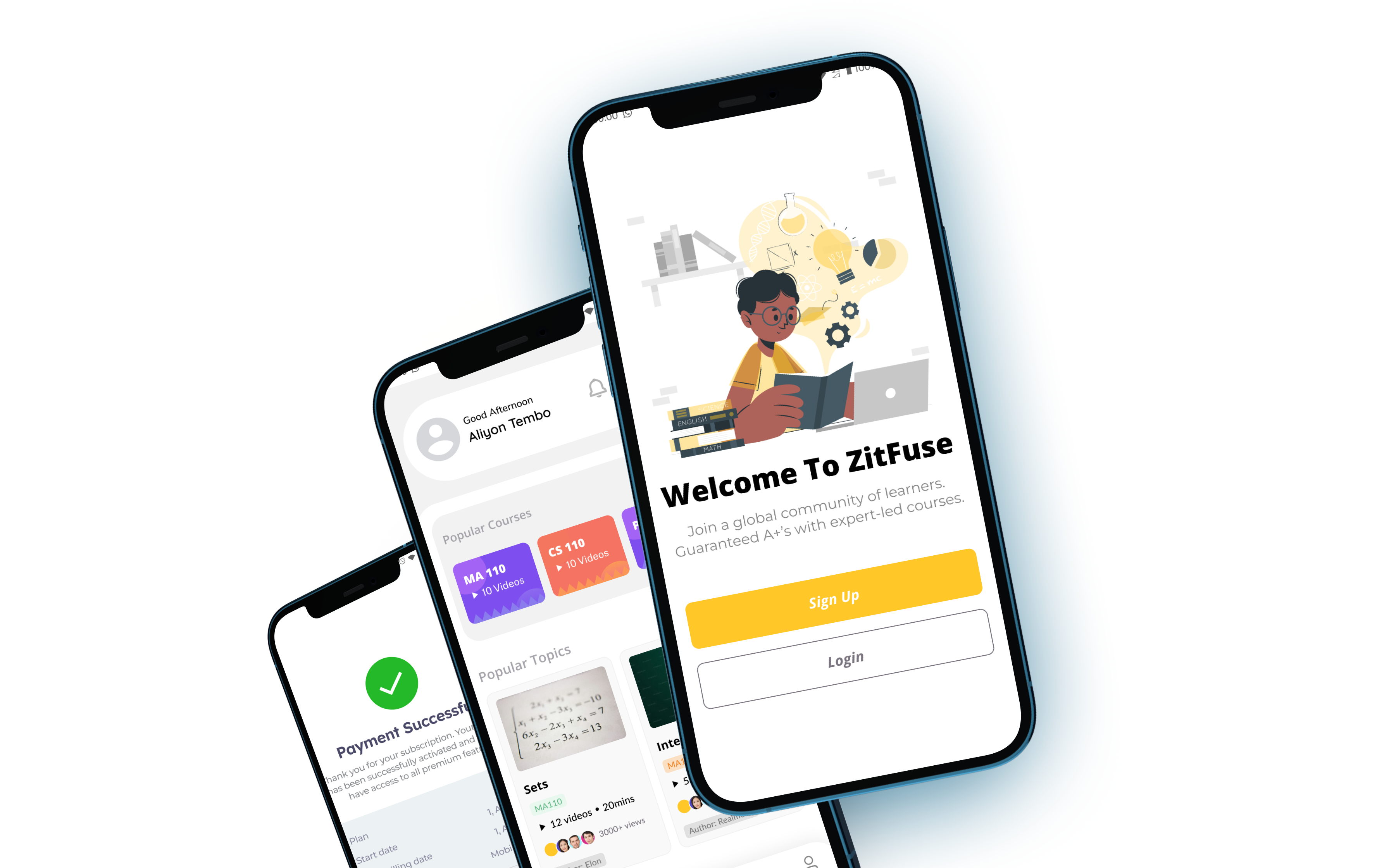
Key screens from the Zitfuse mobile app redesign
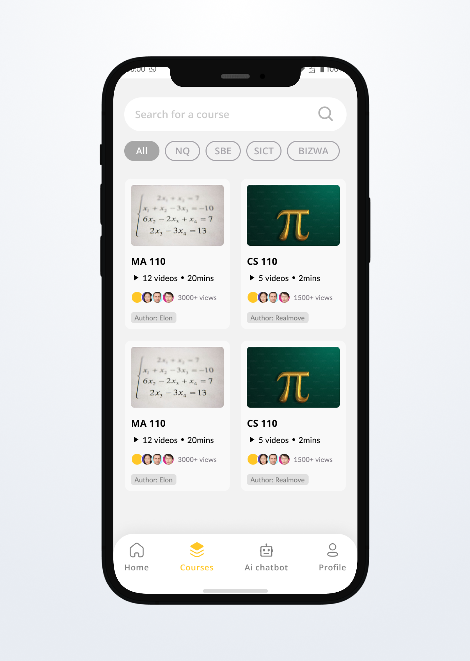
Redesigned Zitfuse app interface, showing courses
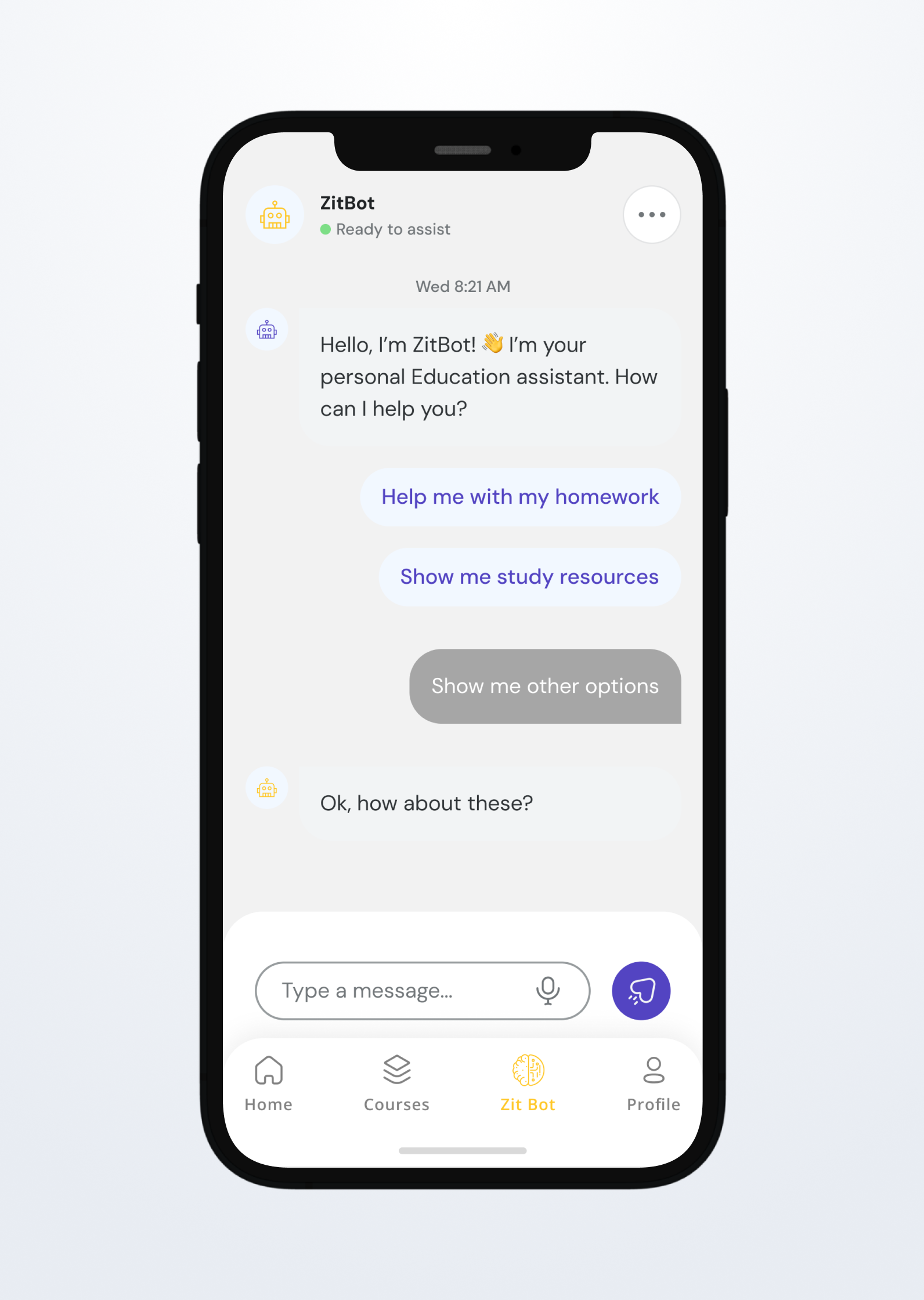
Interface showing the AI chatbot feature for student support
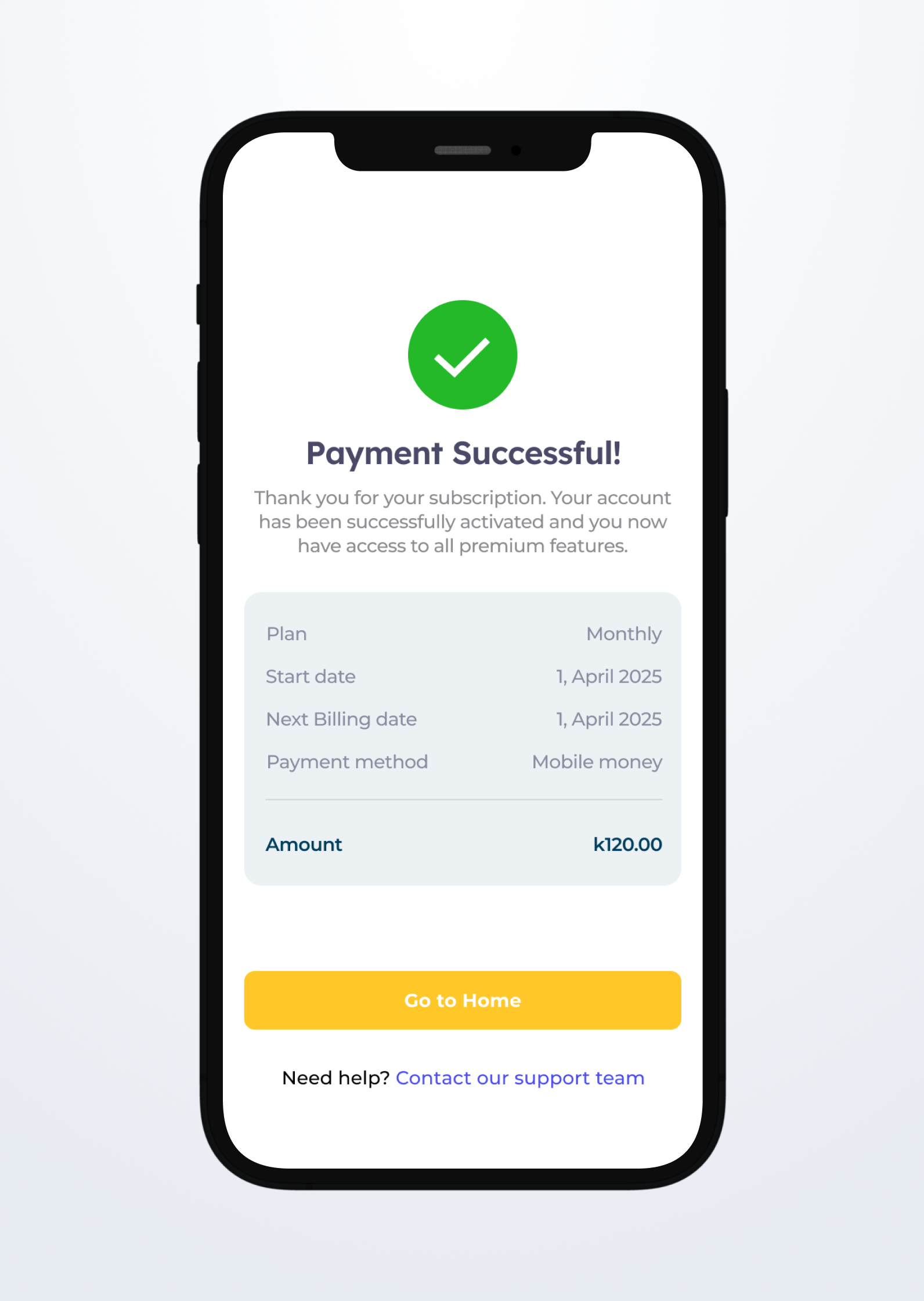
Interface displaying the payment flow for course subscriptions
Results & Impact
The redesigned Zitfuse app launched to immediate positive feedback from users and significant improvements in key metrics across the board.
User retentions & Growth
Increased user base from a mere 100 to over 4000+ students
App Store Rating
Improved from 3.2 to 4.8 stars after redesign
User Satisfaction
Increase in overall user satisfaction scores
User Research
We conducted extensive user research to understand the pain points and needs of mobile banking users. This research formed the foundation of our design decisions.

Mukula Chikonde
19 • First-Year University Student
A tech-savvy student who values quick access to course materials and a smooth mobile learning experience.
Goals
- Access lecture videos and notes instantly
- Stay updated with class schedules and announcements
- Use a mobile-friendly platform for on-the-go studying
Frustrations
- Slow-loading content
- Disorganized course layout
- Limited offline access to resources
Mike Tembo
25 • Part-Time Student & Working Professional
A busy professional pursuing a degree while managing work commitments. Needs flexibility and clarity in learning.
Goals
- Learn at his own pace through pre-recorded sessions
- Track progress and upcoming deadlines
- Easily download and organize materials for offline use
Frustrations
- No progress tracking dashboard
- Unclear module structure
- Lack of reminders or notifications for deadlines
User Journey Map
Onboarding
Actions
- Downloads Zitfuse app
- Creates account
- Explores subject catalog
Thoughts
- "Looks promising"
- "Hope it has my exam content"
Emotion
Opportunities
- Add course recommendation engine
- Highlight popular subjects upfront
First Use
Actions
- Selects a subject
- Accesses lesson
- Downloads past papers
Thoughts
- "This is helpful"
- "Nice that I can use it offline"
Emotion
Opportunities
- Introduce guided walkthrough
- Gamify first few actions for engagement
Revision Flow
Actions
- Takes a quiz
- Checks instant feedback
- Bookmarks tough questions
Thoughts
- "This feels like real exam prep"
- "I need more of these tests"
Emotion
Opportunities
- Auto-suggest more quizzes based on performance
- Allow custom quiz generation
Community Interaction
Actions
- Asks a question in forum
- Replies to a peer
- Likes tutor comment
Thoughts
- "Good to see others studying"
- "This is encouraging"
Emotion
Opportunities
- Push notifications for active threads
- Highlight expert responses
Subscription Decision
Actions
- Views pricing
- Compares course options
- Proceeds to payment
Thoughts
- "K65 is fair"
- "Do I really need all subjects now?"
Emotion
Opportunities
- Offer trial or bundle discount
- Provide testimonial popups at checkout
Long-Term Use
Actions
- Completes a module
- Gets progress badge
- Shares referral link
Thoughts
- "I’ve made real progress"
- "Let me tell my friends"
Emotion
Opportunities
- Unlock social sharing incentives
- Show monthly learning summary
Design System
We created a comprehensive design system to ensure consistency across all touchpoints and enable faster design and development iterations.
Color Palette
Primary Yellow
#FFC727
Primary actions, links
Secondary Purple
#5344C2
Headings, CTA
Success Green
#10B981
Success states, confirmations
Error Red
#EF4444
Errors, destructive actions
Neutral Gray
#6B7280
Secondary text, borders
Background
#F9FAFB
Page backgrounds, cards
Typography
Heading 1
32px • 800
Page titles, main headings
Heading 2
24px • 700
Section headings
Body Large
18px • 500
Important body text
Body Regular
16px • 400
Regular body text
Caption
14px • 500
Labels, captions
Components

Primary Button
Main call-to-action buttons
Input Field
Form inputs with validation
Course Card
Individual transaction display
Testing & Validation
We conducted multiple rounds of testing to validate our design decisions and identify areas for improvement.
Testing Methodology
- Moderated usability testing with 12 participants
- A/B testing of key interface elements
- Heuristic evaluation by UX experts
- Accessibility testing with screen readers
- Performance testing on various devices
Key Insights
Improved Task Completion
60% fasterUsers found course content faster with the new design
Confusion with Navigation
25% struggled25% of users had difficulty finding the settings menu
Mixed Feedback on Colors
Some users preferred the original yellow color scheme
Project Timeline
The project was completed over 14 weeks with clear phases and deliverables at each stage.
Research & Discovery
3 weeksActivities
- User interviews
- Competitive analysis
- Stakeholder workshops
Deliverables
- Research report
- User personas
- Journey maps
Ideation & Strategy
2 weeksActivities
- Design thinking workshops
- Feature prioritization
- Information architecture
Deliverables
- Feature roadmap
- Site map
- User flows
Design & Prototyping
6 weeksActivities
- Wireframing
- Visual design
- Interactive prototyping
Deliverables
- Design system
- High-fidelity mockups
- Interactive prototype
Testing & Iteration
3 weeksActivities
- Usability testing
- A/B testing
- Design refinements
Deliverables
- Testing report
- Final designs
- Handoff documentation
Lessons Learned
Every project teaches us something new. Here are the key takeaways from the Zitfuse redesign.
What Worked Well
User-Centered Approach
Starting with extensive user research led to more targeted solutions and better outcomes.
Iterative Design Process
Regular testing and iteration helped us catch and fix usability issues early.
Challenges Faced
Technical Constraints
Some design ideas had to be simplified due to development timeline constraints.
Stakeholder Alignment
Getting all stakeholders aligned on priorities took longer than expected.
Key Insights
Accessibility First
Designing for accessibility from the start improved the experience for all users.
Performance Matters
Even small improvements in app speed had significant impact on user satisfaction.
Team & Credits
This project was a collaborative effort. Special thanks to the amazing team that made it possible.

Aliyon Tembo
Lead UX Designer
Led user research, created design system, and designed key user flows
Amos Kanyanta
Backend Engineer
Streamlined backend integration for course content and user data
Chiyesu Mashimbwa
Frontend Engineer
Implemented responsive design and optimized performance for mobile devices
Joshua Sibanda
Web Designer
Designed the web version of ZitFuse, ensuring consistency with mobile app